I just posted a new design on Instagram and wanted to write a few words about it here because it’s been OVER ONE YEAR since I’ve made a blog post and if anyone comes here after seeing the Insta post, I want to confirm this blog site is ALIVE. Not dead. As it might otherwise […]
Author: Annie
Gil Schafer, My Dream Dad
or Every picture tells a story, don’t it In my last post, ahem….. back in January….. I said I’d return to discuss neutrals and color, but changed my mind. HA. I had a lot of time to change it in. Neutrals are still on tap but the color part will come later. You see, the […]
Are You Still Thinking About Neutrals?
Yup. And I’m being slow about it, too. I caught heck from myself for not posting in December and now it’s the end of January. It’s much easier for me to design than write and so design I do. And then remind myself to write and say oh, yeah, later today and then later today […]
Neutrals will take you where you want to go
Neutrals can take you just about anywhere you want to go… at home, that is. My last post covered the essentials of neutrals … whether they are warm, cool, light, or dark, as well as their undertones and saturation levels. Today, I discuss how to use neutrals and these attributes in interiors. Two […]
Designing a Neutral Entry with Pattern and Contrast
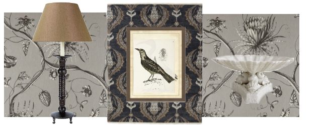
It’s the last day of the month and the post I intended for October is not done, so I offer a design instead, in my current theme of neutrals. You might have seen this board earlier on Instagram. The point is, of course, neutrals and I conceived this as the entry to a cozy midwestern […]
Neutrals anew, a refresher in the basics
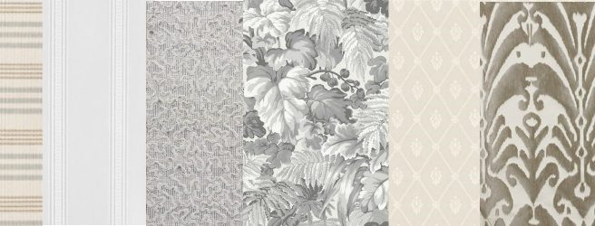
Tain’t what you do but the way that you do it. I love neutrals. I might be late to this party as neutrals have been popular for a long time and their trend has peaked and maybe lavender is now where it’s at but good design is not dependant upon any particular color and anyway, […]
How to Design a Design Board
End of June, end of suspense. I concluded my last post with this board showing the basic elements of a fresh, summer-coloured design. All the primary pieces are shown and the secondary pieces notated I was about to select the secondary elements to the board when I was called away to my summer vacation. I spent […]
Summer Colors
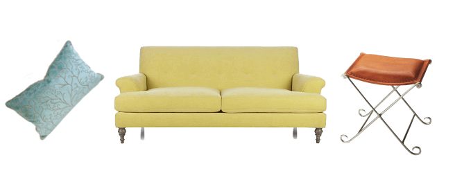
Who needs to go on vacation when you can stay home with these fresh colors of summer? Of course, we all need a vacation, but today’s design board, made up of the sherbet colors of summer, just might help prolong it… Sneak preview A few elements from the design board you will see near the […]
Sasha Bikoff and Me
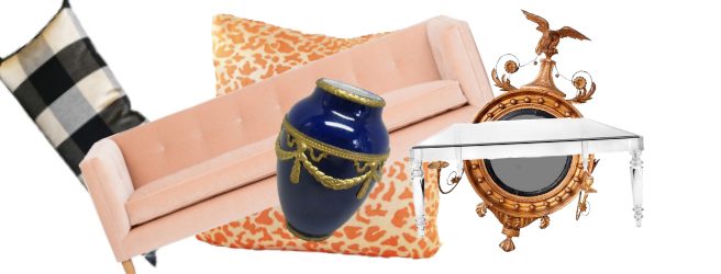
GO BIG OR GO HOME Home to Sasha Bikoff’s mother’s, that is. I’ve had my eye on Sasha Bikoff for a few years now. Below is her mother’s apartment in NYC– which she designed and is the first image I ever saw of her work. I don’t mind telling you, it got me pretty excited. […]
Three Pretty Plain Sitting Rooms
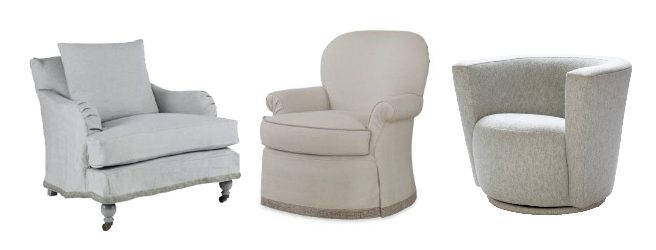
One Layout, Three Styles When I first began making mood boards, I made three versions of a sitting room, each in a different style. To highlight their differences, I made all in neutral tones and as simple and similar as possible. There was nothing academic about this; I just selected styles I was curious about and chose […]
