I just posted a new design on Instagram and wanted to write a few words about it here because it’s been OVER ONE YEAR since I’ve made a blog post and if anyone comes here after seeing the Insta post, I want to confirm this blog site is ALIVE.
Not dead.
As it might otherwise appear.
This is the new design.
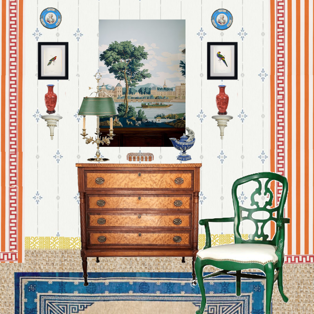
Which is actually a re-work of an earlier design.
Here is the earlier one.
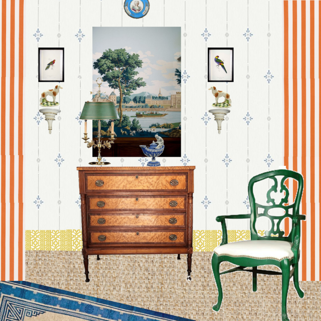
Not too different, but I thought it could be stronger. More focused. So I changed it and now I like it better.
Let’s look at them side by side
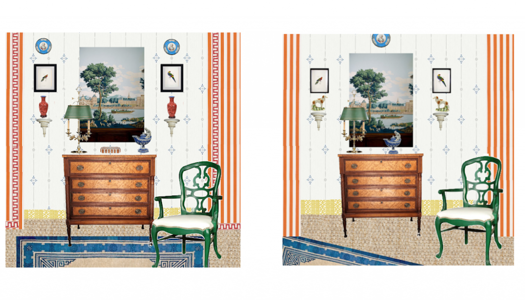
Comparing them, you see I tightened the new one up a bit. But I also wanted to keep the design light and open. Did I go too far?
The new board again

To review, I tightened up the negative space ( art lingo for the ever- important space between things), added trim to the curtains, more colour to the wall and a striped box, mimicking the curtain pattern, on top of the commode.
My recipe and inspiration for Neoclassical Whimsy
First, if Neoclassical Whimsy is a new term for you, I’m not surprised, because I just made it up. Feel free to adopt it.
I hope it expresses the spirit of this design and many others that could follow, if my recipe is followed. More or less. No straight-jackets here.
Inspiration then recipe.
The inspiration began with my love for antique furniture and this beautiful American Sheraton commode.
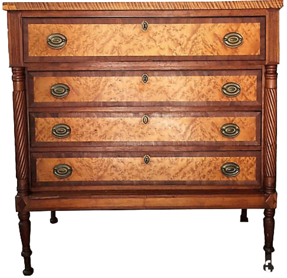
Sheraton is an American version of the Neoclassic style in furniture, which began around 1770 and lasted into the early-mid 1800’s. Roughly speaking. Style history is a subject I make no claims to expertise in; just swinging at the the high points here.
Back to our story…I’m also partial to the accessories often used in antique/traditional interiors…wall brackets, porcelain plates, chinoiserie vases, coloured prints of flora and fauna, etc. Yes, I believe that’s now called Granny Millennial.
However, I am not fond of the predictable or stuffy. So, what to do?
In this case, I used strong color and added some contemporary…relatively speaking… pieces. Specifically, this Hollywood Regency chair which comes directly from The Greenbriar Hotel.
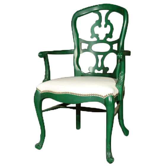
It delights me to combine fine elements in unexpected ways. This is not a new concept but the melding of Neoclassicism and Gustavian, which is the lighter, Swedish version of Neoclassicism, with Hollywood Regency and its tradition of robust shape and color is an unusual pairing. You could say, I married the sobriety of classicism with the Tom-foolery of Hollywood Regency.
So, that’s the recipe.
But let’s talk about whimsy in itself. The first obstacle was tradition without being stuffy; we covered that. But how to introduce whimsy without being cute?
First, I used symmetry to ground the whimsical color and style mix. Then, I used elements of high quality and strong personality.
And always, importantly, I seek elements that have an underlying spirit of camaraderie, avoiding difference for differences’ sake alone. For example, note the repetition of stripes throughout the design; the commode has a series of bands that are repeated by the stripe in the curtain fabric, the wallpaper, on the box, and the Greek key pattern is a geometric line while the chair back uses line organically. Additionally, the rug has a linear band around its perimeter. These are the sort of details that bind apparently dissimilar elements.
The elements of the board
I thought it might be fun to do a Get the Look board.
But that’s not so easy. Most of my elements are antique and therefore hard to duplicate. After a couple hours seeking replacements for the irreplaceable, I realised the more realistic option is an Elements board.
In other words…..I could do a Get The Look but I’d like to publish this before the Next Millenia. And nobody wants to wait for that.
Ta daa….
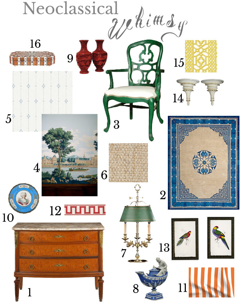
If you want to try your hand at getting the look
This is what to search for
- A fine Neoclassical style commode
- A blue and white Chinese rug
- A Francis Elkins Loop chair Of the chair on my board there are few, as it is an original from the Greenbriar Hotel. A Francis Elkins style Loop chair would be a good replacement. And can be painted in any color.
- A pastoral mural
- A Gustavian wallpaper
- A seagrass rug
- A bouillotte lamp with a green shade
- A Wedgwood vestal tea pot
- A pair of cinnabar vases
- 2 porcelain plates in a vibrant blue
- Orange and white stripe fabric
- Miles Redd fabric tape in the Greek key design
- A pair of coloured bird prints
- A pair of wall brackets
- Schumacher Zanzibar Trellis wallpaper
- An inlaid bone box Stripes are not always easy to find, however, a pattern of some sort is desirable.
I am working on linking to a promising source for each item. If you don’t find anything suitable at the site offered, keep digging; there are many good online sources for vintage or antique furnishings. Chairish, One Kings Lane and 1stDibs are three of my most often visited. And, of course, there is always eBay and online auction houses as well.
Be forewarned! These furnishings are rich. But, maybe you have friends with deep pockets who would like to sponsor you? ; )
Happy October 2020!
And remember, this too shall pass.
xo
