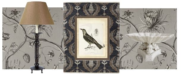
It’s the last day of the month and the post I intended for October is not done,
so I offer a design instead, in my current theme of neutrals.
You might have seen this board earlier on Instagram.
The point is, of course, neutrals and I conceived this as the entry to a cozy midwestern home–
similar to where I grew up.
My intent for the entry was comfort, tradition, charm, liveliness and a bit of drama… just like life on a lake in a Minnesota town.
MY BOARD
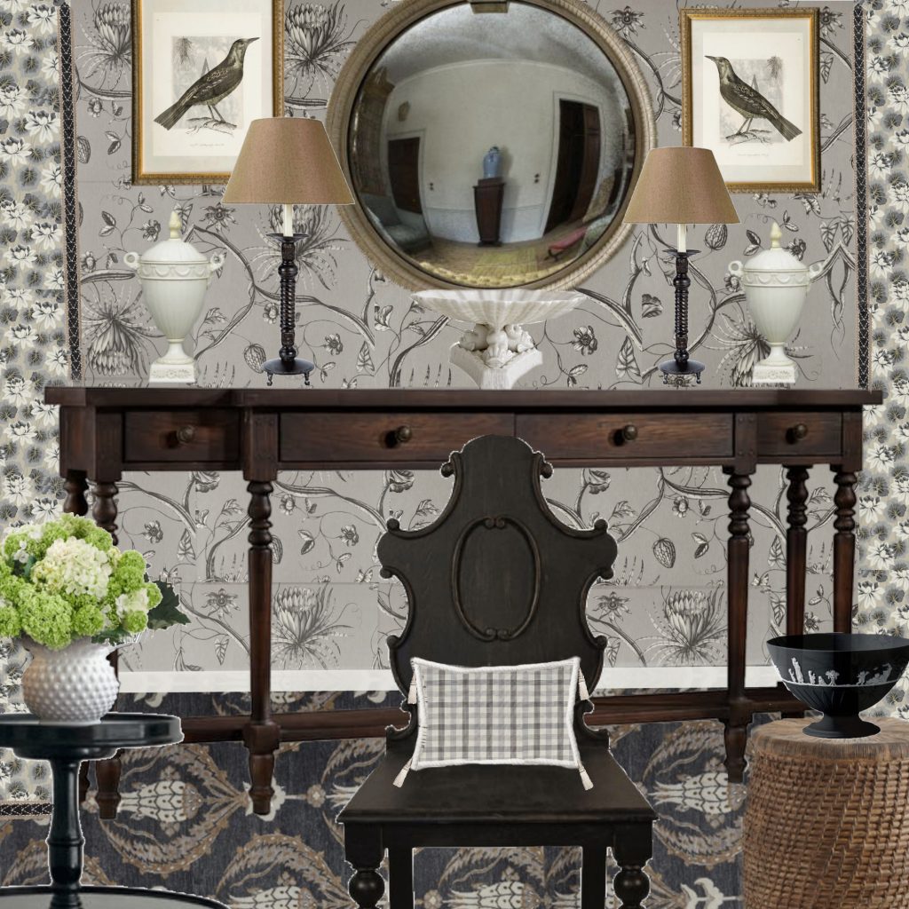
A patterned entry in neutrals
To accomplish this I used traditional elements enlivened by layers of pattern and multiple value and shape contrasts.
WALLPAPER
My jumping off point for the design was this swinging, organic wallpaper from Zoffany.
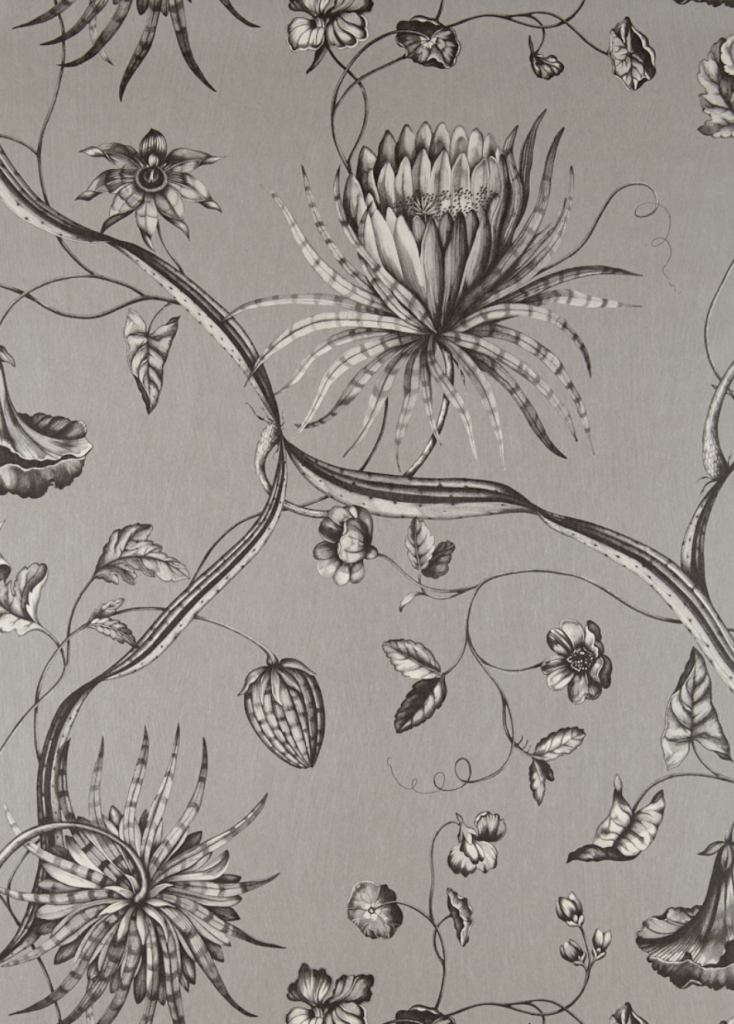
Phaedra in silver
I love anything Zoffany and when it’s a mood board, I don’t have to care about the price. Haha.
It’s a glamorous wall covering, but in my quintessential, contrarian manner, I wanted to place it in a homey, traditional environment.
CURTAINS
I wanted a pattern for the drapes that would contrast with the wallpaper and blend at the same time.
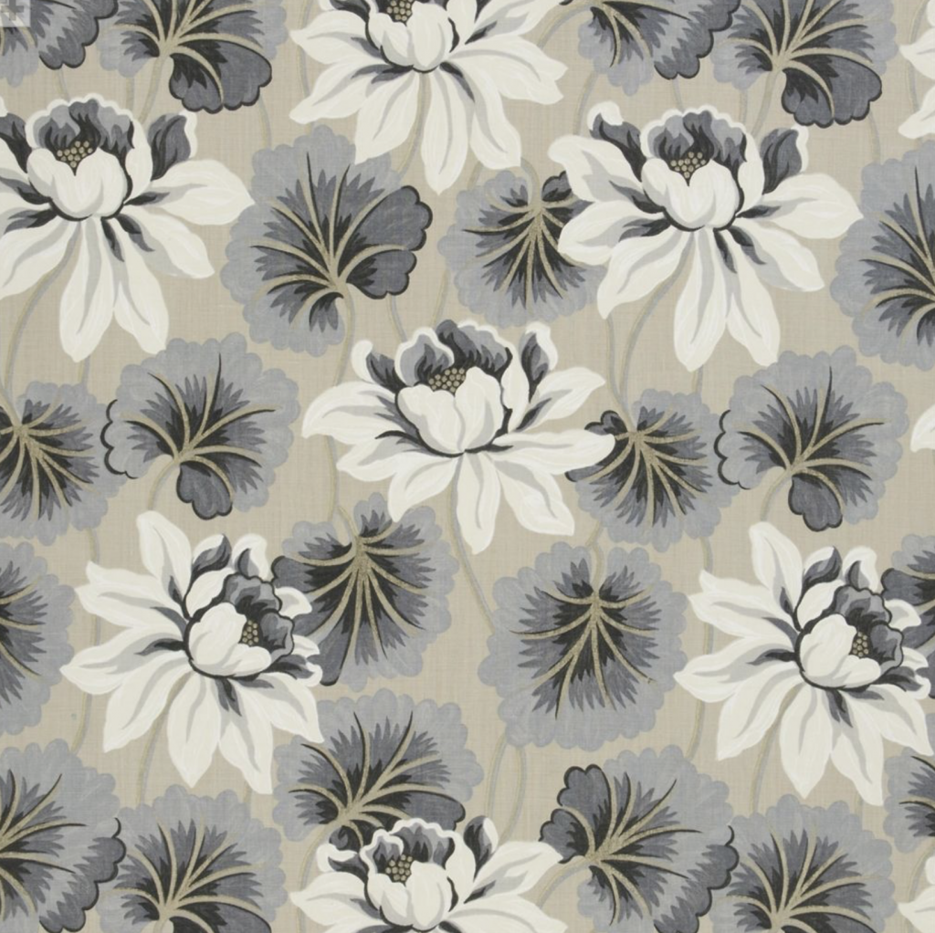
Designers Guild Baudard linen
I like how this closed pattern contrasts to the open design of the wallpaper, but when I see the fabric enlarged, the undertones come forward and fall a bit flat next to the wallpaper. I don’t know. Maybe it’s just different than what I envisioned but works in its own way. I think so.
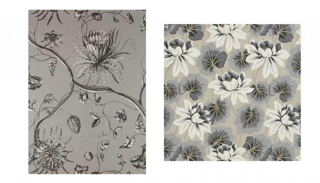
Side by side and enlarged, it’s easy to see that the wallpaper has a violet undertone, while there’s blue and green in the undertones of the fabric.
RUG
The third major element of the entry is this rug from Williams Sonoma.
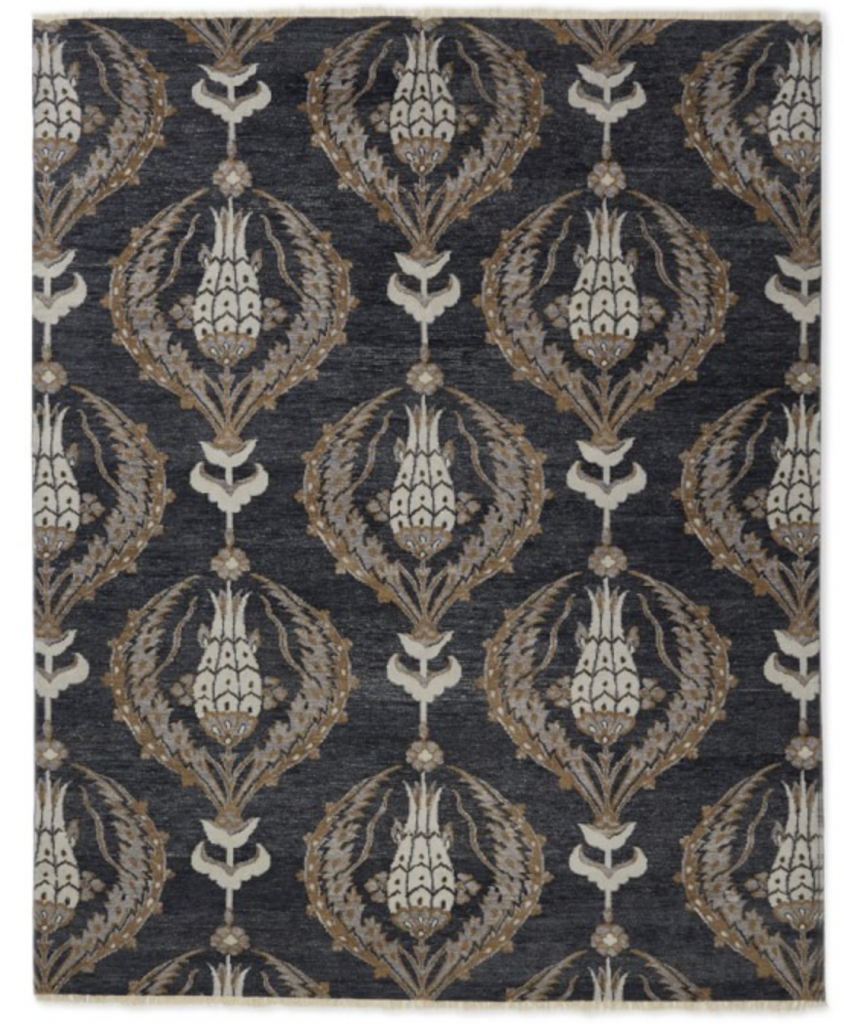
Ottoman Garden hand-knotted wool
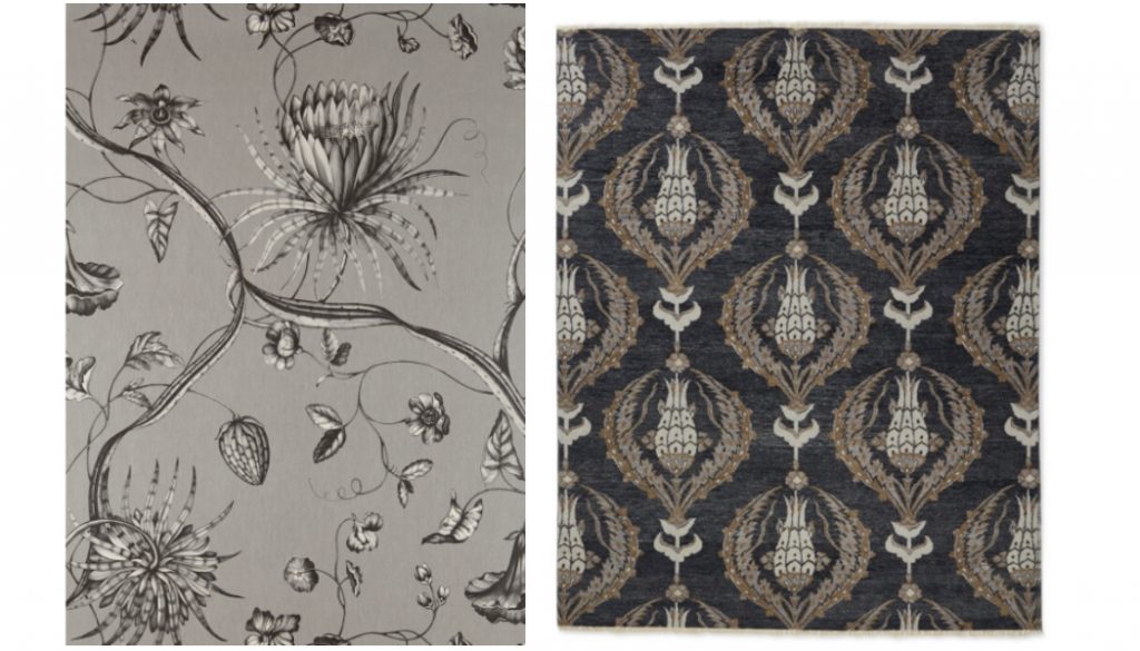
The open, asymmetry of the wallpaper contrasts to the structured pattern in the rug. However, compatible neutrals and an organic aspect in the rug pattern make them connect.
If I were to do this room for real, I would keep the wallpaper and rug but consider changing the drapery fabric.
an alternate rug
I considered this as an alternative to the Williams Sonoma rug.
Why? I don’t know. I just like to consider all options.
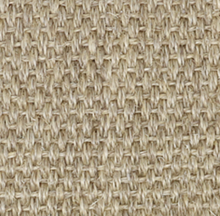
Curran Stockholm rug in Spring
The natural fiber would be beautiful, just different than the WS rug.
It would open the space up a bit and let the wallpaper sing more loudly.
And it would offer a warm contrast to the grey wallpaper.
I’ll make a new board with this so we can see its effect. Someday.
CONSOLE
In line with the homey, Minnesotan theme, I selected this country style console by Hooker.
The traditional brownwood and simple lines ground the slightly wild wallpaper,
and the warm brown offers contrast to the paper’s cooler grisaille.
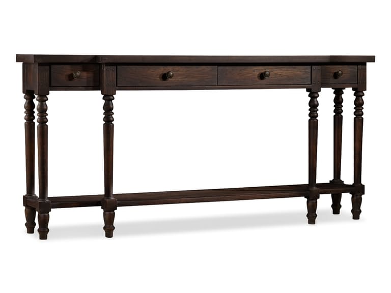
Da Valle Console Table
A linear shape and rounded details relate to the those same qualities in the wallpaper,
and four drawers and a long surface,
for placing objects of necessity and decor,
make it a practical entry console.
LIGHTING
There are rarely too many light sources in a room.
Ideally, in this space there would be an overhead pendant or lantern for general lighting in addition to smaller, more intimate lighting.
For intimate lighting, the length of this console screams for a pair of matching table lamps.
However, finding a pair with the right personality is the trick.
There are many that could work just fine but I wanted something fabulous that would bridge the exuberance of the wallpaper with the sobriety of the console.
Exuberance and sobriety….
I thought this one fit the bill.
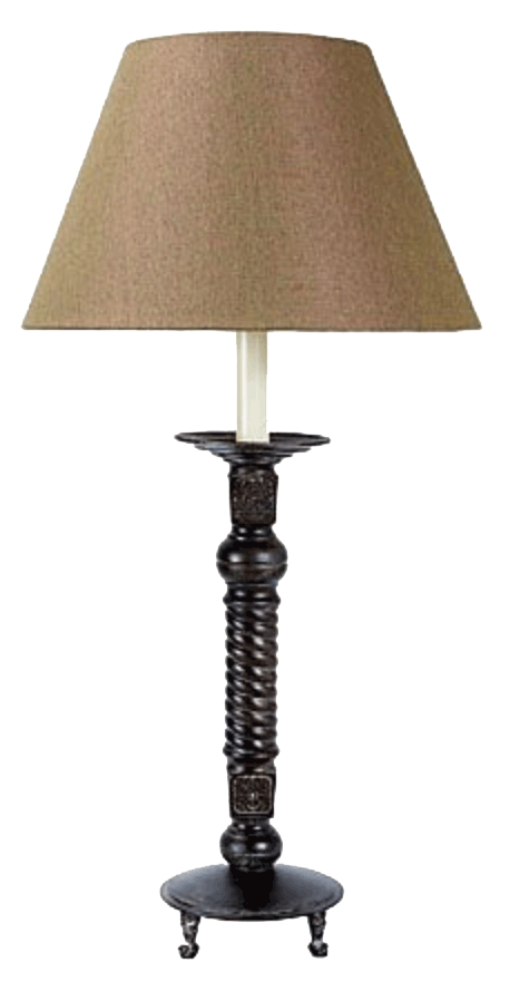
Source unknown
I put this lamp in my files without its source and havn’t been able to find it.
The twisting detail on the lamp stand, the sweet little feet, the lip below the neck… jaunty and down earth at the same time.
However, I have one objection, and that is the linearity agrees almost too well with the console, repeating and emphasising the table’s long skinny legs.
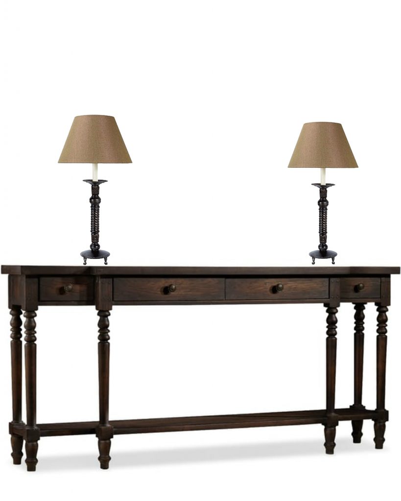
See what I mean?
I thought of switching the lamps out with a bulbous shaped lamp but then I wouldn’t be able to use these gorgeous blanc de chine urns.
Or so I thought. Another idea for the new board.
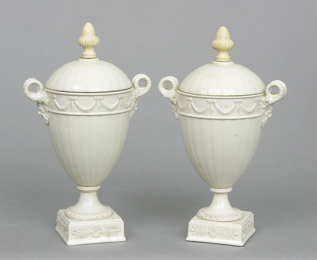
Aspire Auctions
It’s hard work making these decisions.
I gave in for the moment just to get the design complete, figuring I would go back and adjust later.
Sometimes I just need to see a thing complete to know how to improve it. It’s a process.
Well, that’s it for tonight.
More on neutrals to come,
as promised.
xo
Miss Ann
