GO BIG OR GO
HOME
Home to Sasha Bikoff’s mother’s, that is.
I’ve had my eye on Sasha Bikoff for a few years now.
Below is her mother’s apartment in NYC–
which she designed and is the first image I ever saw of her work.
I don’t mind telling you, it got me pretty excited.
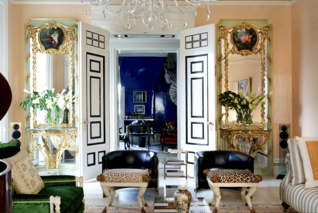 Photography: Nicole Cohen
As in…
WOWZA!
BRILLIANT WHITE DOUBLE DOORS TRIMMED IN BLACK!
DOUBLE FANCY GILT MIRRORS-CONSOLES !
GLOSSY PEACH, GLOSSY INDIGO WALLS!
LEOPARD PRINT, DEER-HOOVED BENCHES!
!!!!!!!!!
I needed to lie down to absorb the exuberance–
the utter insouciance of it.
At least thats how I remember it.
Then, needing to know more about this creative wunderkind,
I dug around and found this
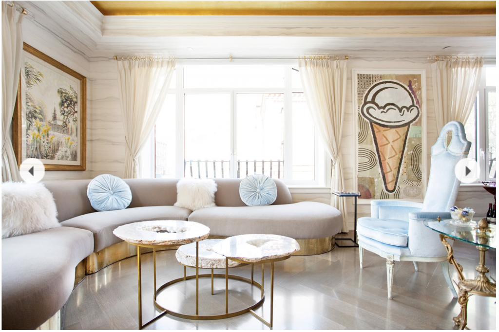
Photography: Patrick Cline
and this
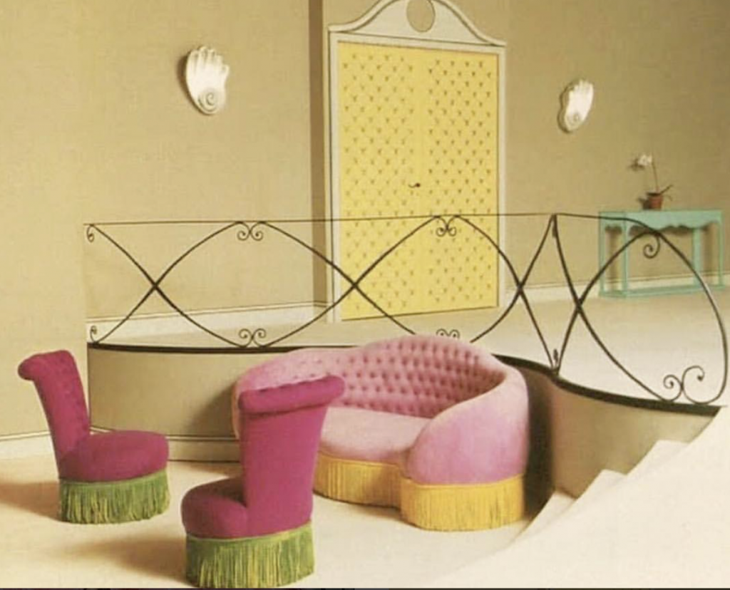
image source
Which I could eat for breakfast, lunch and dinner.
It’s not that I love EVERYTHING she does…
rather the spirit with which she does what she does:
the exuberance, the play, the easy relationship to materials, color, periods–
the being fun at a party!
I was especially excited when I read she had a fine arts degree, and not an interior design one,
just like moi!
We’re a couple generations apart in age but no matter.
Now to the present.
Her installation at the 2018 Kips Bay Showhouse has been published and it is a doozy.
Check this out.
You might need to lie down afterwards.
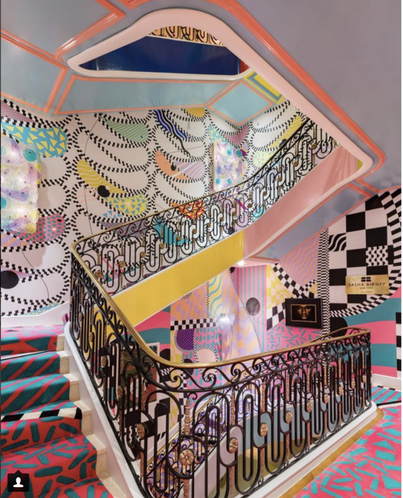
image source
ONE WORD
crazystunningmagic
Enough about Sasha.
Let’s talk about me.
And how I came up with one of my recent designs.
To Begin with
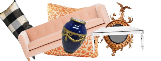
I found this pink couch on OKL and because I loved it I wanted to make a room with it.
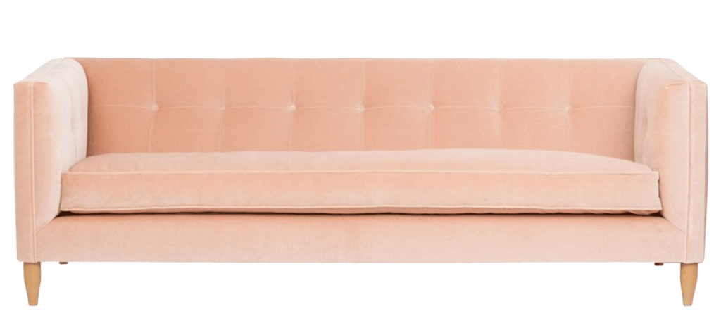
I love it’s simple lines,
it’s exquisite proportions–
note the height of the horizontal base to the seat cushion — and those two in relation to the back-height–
and then that luscious, delicate pink they call blush.
( I just read Sasha Bikoff’s favourite color is pink but I swear I didn’t know that before.)
So I messed around with some colors to pair it with–
I tried a neutral,
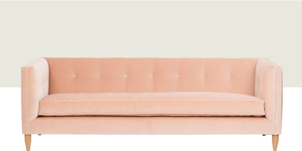
doable but a little ho-hum.
I tried some pale colors
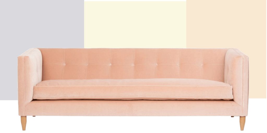
None of these thrilled me individually, but seeing them together now inspires me to create a whole new design with these as a group.
I tried a botanical wallpaper in a neutral colorway,
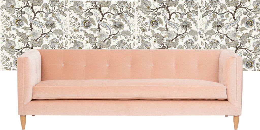
Possible– not fab.
Any of these “backgrounds” could work with some tweaking,
but nothing was making me lie down for the sheer joy of it.
So I continued my search until I found this Raindots wallpaper by Schumacher .

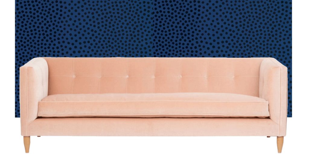
This I liked.
A lot.
Right away.
No turning my head sideways to see if it worked better at an angle.
The Revelation
And then I understood,
that in truth,
I was on a quest for the original, the convention-defying, the piquant–
in other words…
I was having a Sasha Bikoff moment.
All MY LIFE
I have reigned in originality for conventions’ sake;
blend, camouflage, nay…. disappear–
these were my watchwords,
while the wild horse of my creativity pawed at the corral gate.
So, it wasn’t really a Sasha Bikoff moment,
It was a ME moment!
And I seized it and went shopping.
First, in my accessories file, to find a fun, fresh, gorgeous accessory to play off the couch and wallpaper.
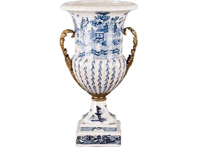
This ormolu’d urn had blue for the walls, a light background for the couch
and a curvy, fancy shape for contrast with the sofa.
So, all together, so far,
I had this
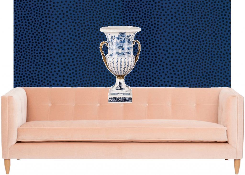
And this was looking good.
I loved the dark mystery of the cobalt/indigo wallpaper
against the ephemeral, fairy-like pink of the couch.
For my next move, I needed a rug …
something light and neutral to show off the dazzling wallpaper, sofa and urn combo.
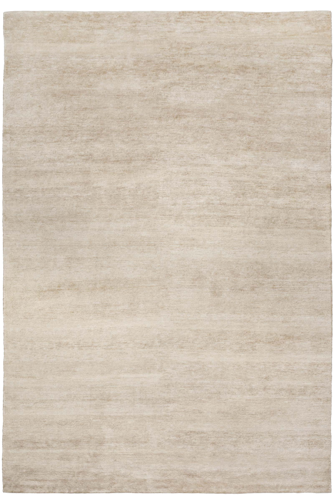
bamboo-silk-pale-gold
Subtle texture, soft color…Check—
which all together made this
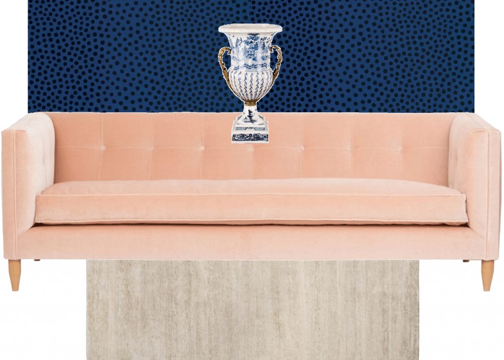
I liked it
Now you need a really special mirror, I said to myself….and went shopping in my mirror files…..
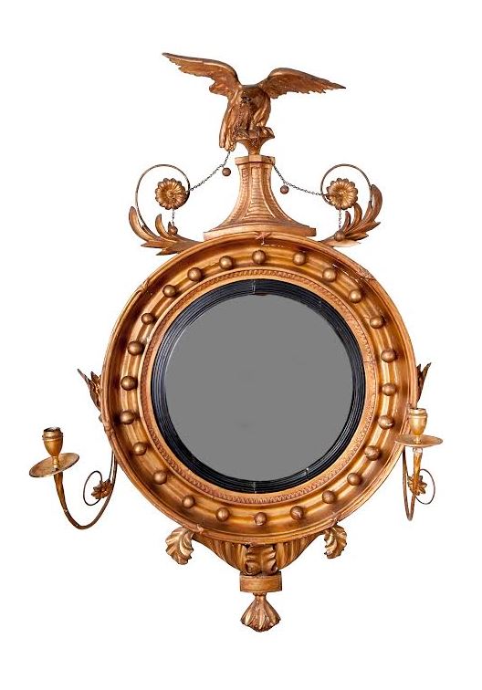 I found this at Meg Braff’s but sadly it’s no longer available
It’s gilted, fancy shape resembles the trophy urn
but
it’s not the first mirror you’d think of
to pair with a mid-century style couch.
And I………. LOVED them together.
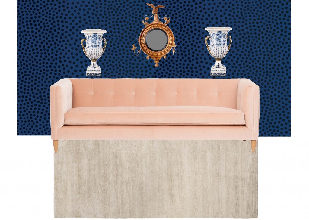
The spirit of Sasha Bikoff beckoned me on….
Fast forward through sorting and picking…..
And I came up with these accompaniments.
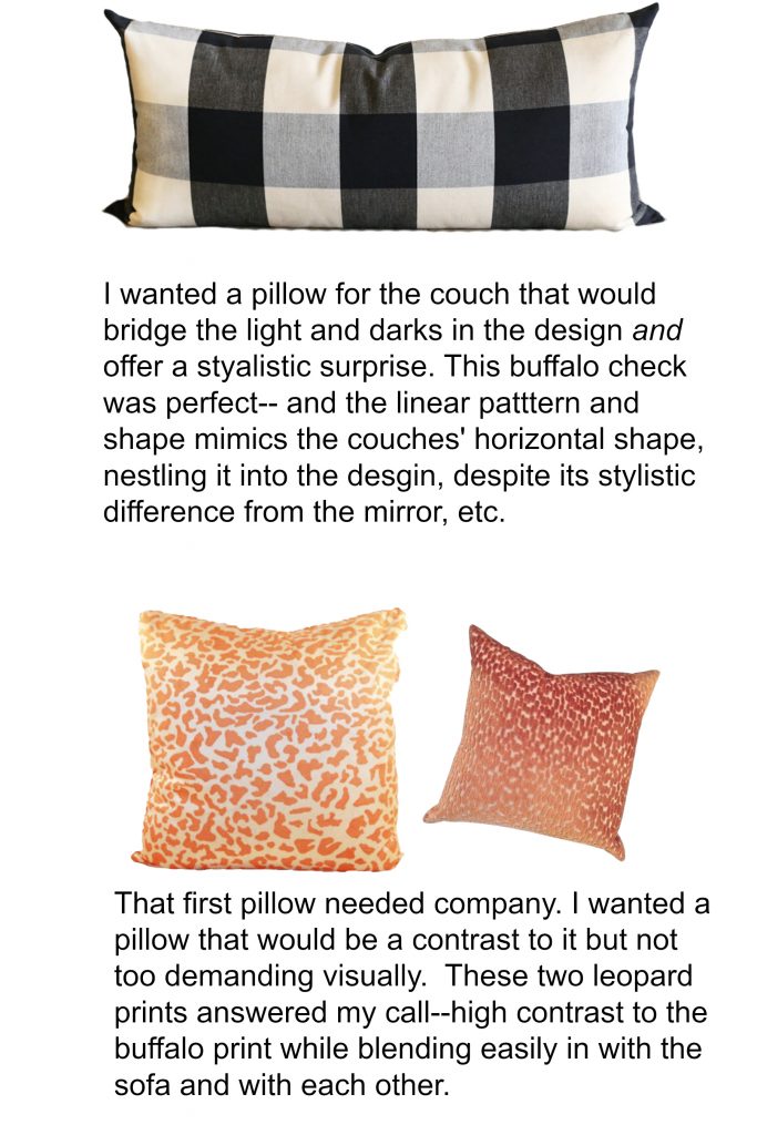
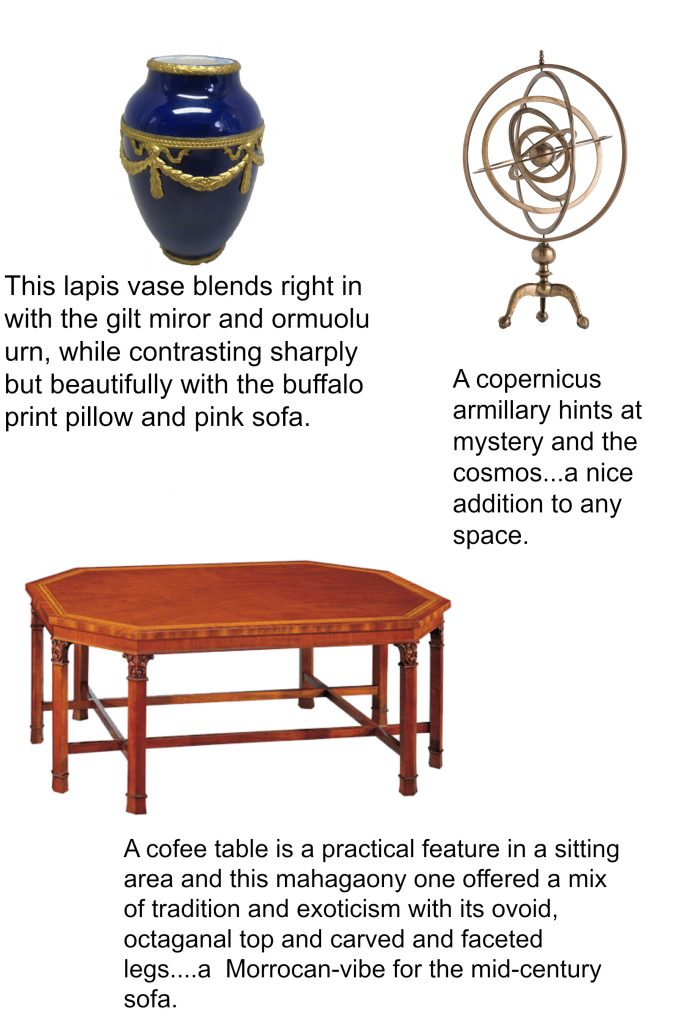
Which all together created this
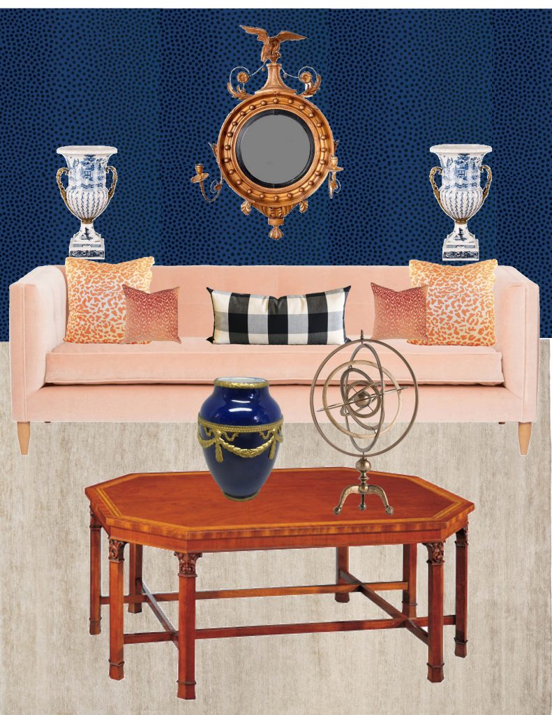
Maybe I should have left well enough alone here, because I like this–
it’s fresh, its beautiful and its fun.
But in my new boundary-breaking M.O. I pushed on, searching for this designs limits.
In other words, asking myself,
“At what point does it go too far?”
Then yanking it back to that sweet spot of vibrancy and cohesion.
Searching for the limit
I thought, try a rug under the coffee table. And put more stuff on the walls.
So I found stuff and a rug and layered them in there.
Voila’.
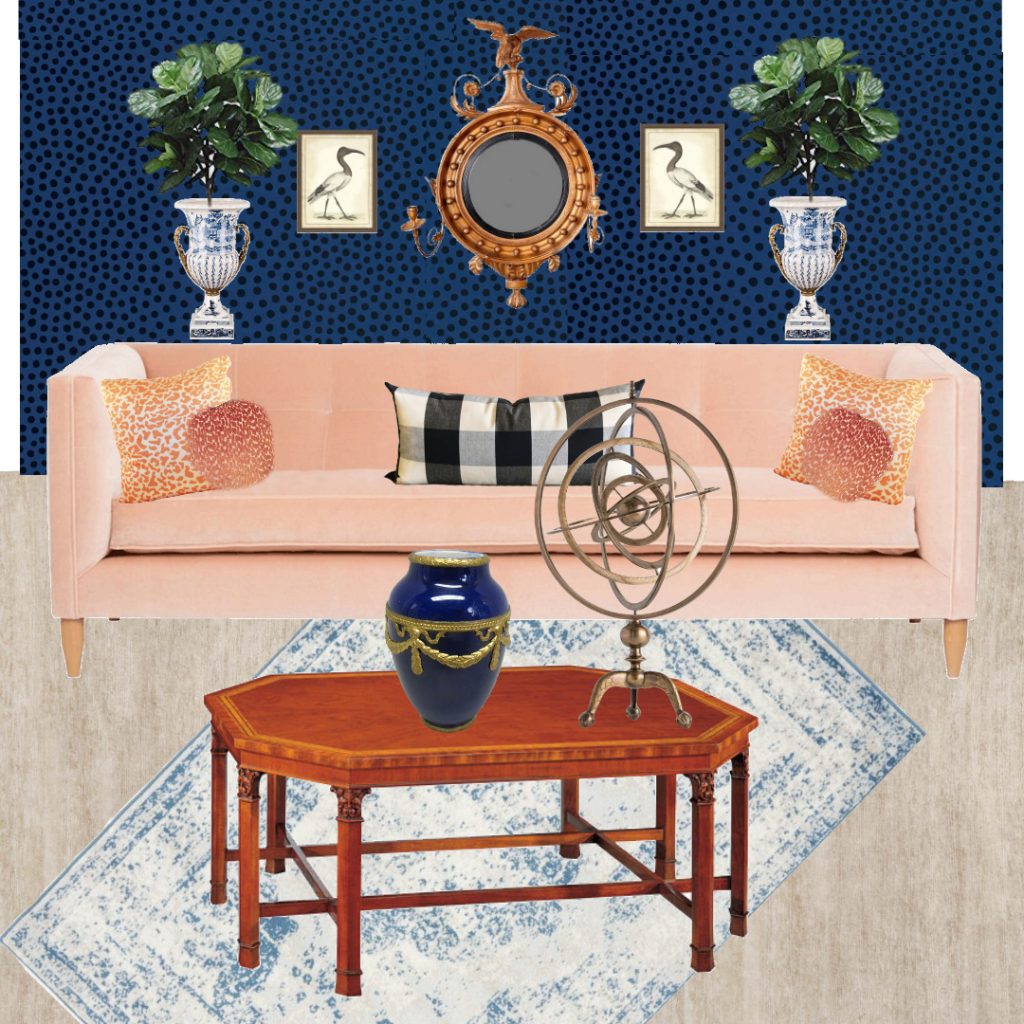
Is it becoming too much? There’s definitely a disconnect between wall and floor…that rug looking too light.
So, I found an antique Chinese rug with a saturated blue like the wall.
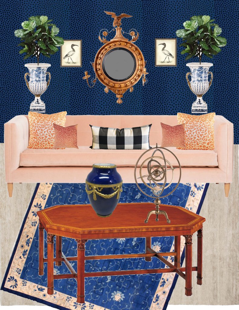
Then I thought it became a bit heavy on the bottom.
The light silk rug under the Chinese rug was suppose to keep the floor from being visually heavy,
but I wasn’t so sure it was enough with that deep blue rug.
After some consideration
I thought
Sasha Bikoff might use an acrylic table where I used mahogany.
Might.
And that would address the heaviness I was sensing.
So I found this.
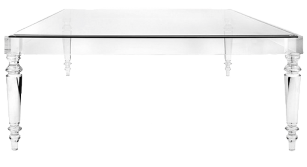
I was looking for a waterfall design but settled for this pseudo-traditional design.
What do you think?
Can this work or would a waterfall design be more true to the material?
Here’s how it looks with the acrylic table
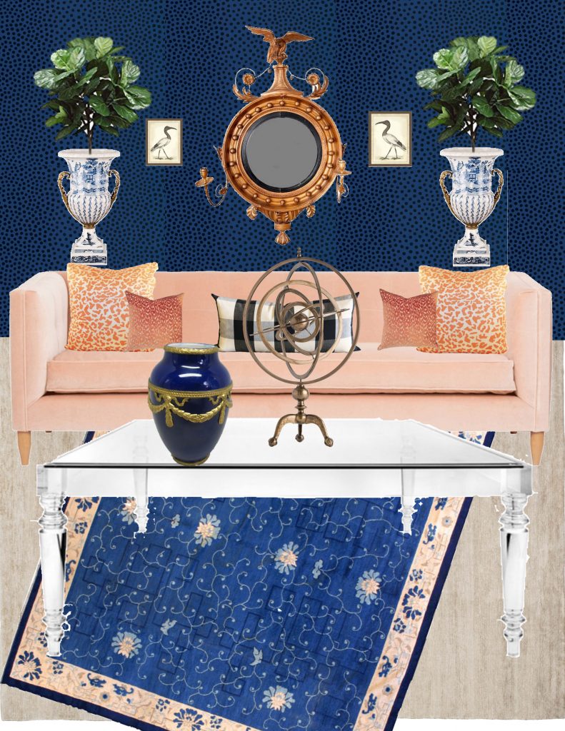
The acrylic looks white in the picture– in real life, of course, it would be transparent.
Which Version?
Any of these could work.
Depends on your taste.
Personally, I like the version with the acrylic table, first.
The mahogany table with the antique Chinese rug, second.
And the faded blue rug as a distant third.
Which do you prefer?
Or maybe you have a suggestion for a fourth version?
Hold up. I do. The original board without the extra rug or stuff on the wall.
That might just be my favourite.
Putting these together, I was driven to be true to my vision,
to NOT concede to my convention-bound, playing-it-safe super-ego.
For which I thank Sasha Bickoff, who inspired the courage I needed to tear this bitt and halter off,
and jump that gfn gate.
And thank you to you,
for stopping by and reading this, my brief tale of creative liberation.
xo
Annie
Heigh ho silver
SaveSave
