One Layout, Three Styles
When I first began making mood boards,
I made three versions of a sitting room, each in a different style.
To highlight their differences, I made all in neutral tones and as simple and similar as possible.
There was nothing academic about this;
I just selected styles I was curious about and chose pieces I thought represented them.
It was a fun project and helped me focus on these styles,
which were specifically…
old world,
traditional and
contemporary.
As you will see, I used about the same elements in each board–
a sofa, side-table, lamp, etc…. just switching them out stylistically.
And one brown wood piece each — for punctuation,
since brown wood is classic enough to be a neutral.
a snapshot of the three rooms
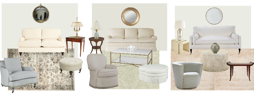
Nothing hair raising about any of these.
But they do show a shift. Especially from the far left to far right.
Now for their close-ups
Old world
 I love the cool grey of the bergere against the creamy couch, and both contrasting with the grisaille rug.
Old world seems to mean curves, tucks, soft shapes, and embellishment beyond strict necessity.
Traditional
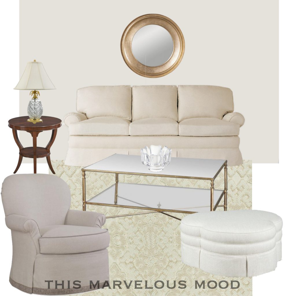
My grandmother would approve of this room. My mother, too, if I added some knick knacks.
Traditional seems to pull back on the embellishment but still retain some flounce. Maybe a bit bland?
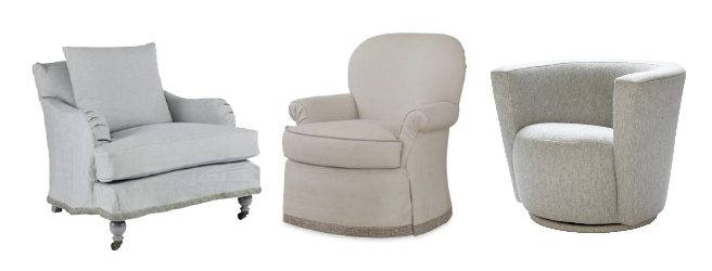
I want to point out this side chair is a swivel rocker from Century. Love.
My mother had a pair of swivel chairs in her living room and they were always the most popular place to sit.
contemporary
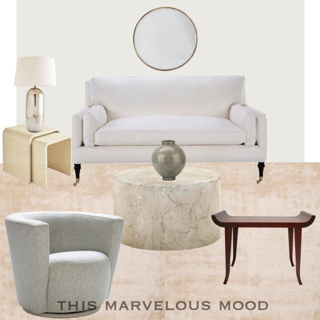
I eschewed contemporary design for the longest time, but I find this soothing and beautiful.
Contemporary seems to streamline, nice and taut.
An unexpected find
For being neutral, these rooms are surprisingly colourful.
Without saturated colors interfering, a group of neutrals can be quite lively.
Though, if I look closely, maybe some of these neutrals are really just pale colors.
Review
Admittedly, these are broad categories with infinite permutations and sub-categories within them.
But I got something out of designing with these imprecise strokes.
What do you think about these styles?
I’d love to hear.
If you have any suggestions, I could make a new board illustrating them.
That would be fun.
Or any other styles you would like to see explored.
I hope you enjoyed looking at these.
I recommend the exercise,
if you get the urge to try it your self–
it’s a great way to while away an afternoon,
and sharpen your sense of design at the same time.
Thank you for stopping by,
and hurrah for Spring, even if it is still snowing.
xo
Annie
